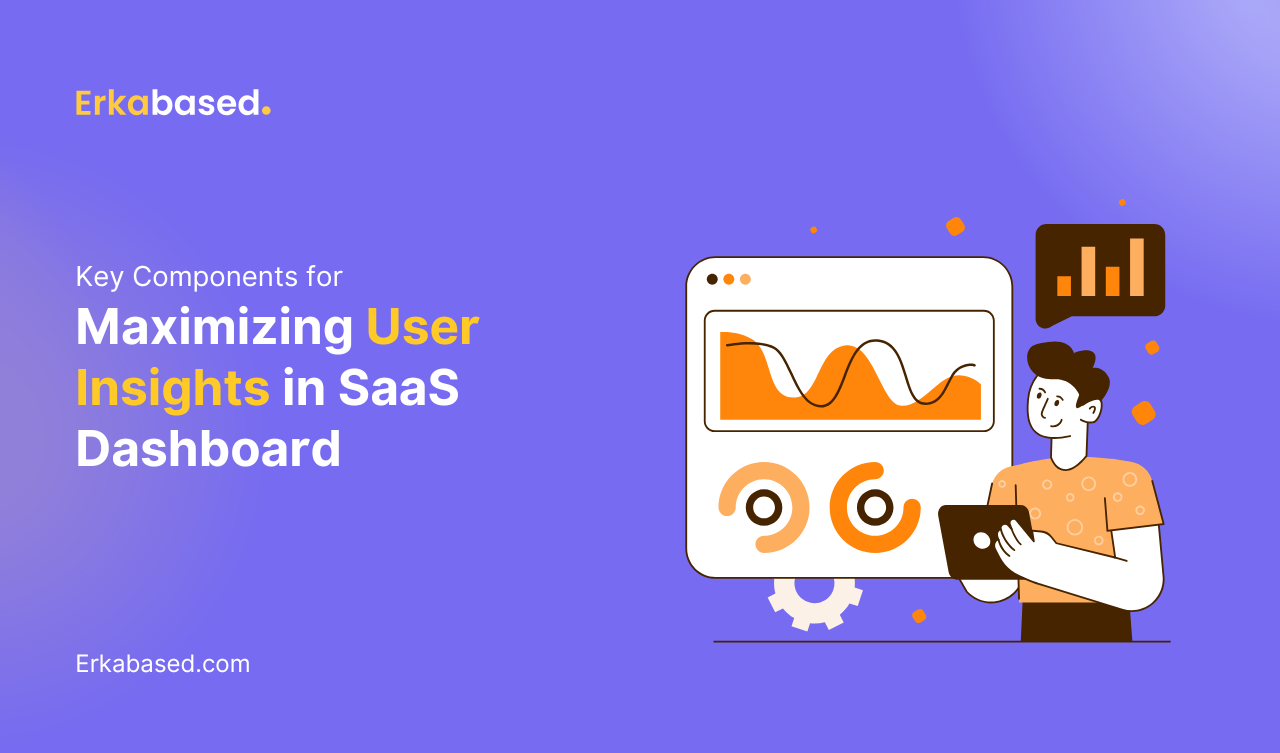
Introduction
In the SaaS industry, data-driven decision-making is crucial to both product success and customer satisfaction. A well-designed SaaS dashboard provides a centralized, real-time view of key metrics, helping users track performance, identify trends, and make informed decisions. However, building an effective dashboard isn’t just about displaying data; it’s about delivering the right insights in a clear, actionable format that empowers users to achieve their goals.
This guide explores the essential components every SaaS dashboard should incorporate, ensuring that it not only looks good but also drives real value for users. Whether you’re creating a dashboard for internal use or offering one as part of your SaaS product, these insights will help you build a tool that enhances the user experience and supports smarter business decisions.
The Importance of a Well-Designed SaaS Dashboard
A SaaS dashboard serves as the control center for users, providing a visual representation of the most important data related to their activities, performance, or system health. The quality of the dashboard directly impacts how effectively users can engage with and utilize your product. A cluttered or confusing dashboard can frustrate users and obscure valuable insights, while a thoughtfully designed one can become a powerful tool for driving engagement and success.
The key benefits of a well-designed SaaS dashboard include:
- Data transparency: Dashboards provide users with immediate visibility into key metrics, allowing them to monitor performance, identify issues, and make data-driven decisions without needing to dig through complex reports.
- Efficiency: By consolidating data into a single, easily accessible location, dashboards help users save time and streamline their workflow.
- Actionable insights: The best dashboards do more than present data—they provide context, helping users understand trends, predict outcomes, and take the necessary actions to optimize results.
User-Centric Design: Tailoring Dashboards to Meet Specific Needs
The foundation of any effective SaaS dashboard is a user-centric design. When developing a dashboard, it’s essential to keep your target audience in mind. The dashboard should be tailored to meet the specific needs and goals of its users, whether they’re business executives, sales teams, developers, or end customers.
Steps to create a user-centric dashboard:
- Understand user roles and objectives: Different users will have different priorities. Executives may want high-level business metrics, while developers might need performance and system data. Tailoring the dashboard to address these different perspectives ensures relevance and usefulness.
- Simplify the interface: Avoid overwhelming users with too much information. A clean, intuitive layout that prioritizes essential data makes it easier for users to navigate and find what they need quickly.
- Customization options: Allow users to personalize their dashboards by choosing which metrics to display and how they are visualized. This ensures the dashboard remains relevant to each user’s specific needs and preferences.
A user-centric approach increases dashboard adoption and engagement, ensuring that the tool remains a valuable resource for users across the organization.
Key Metrics: Providing Meaningful, Actionable Data
At the heart of every SaaS dashboard are the key metrics that provide insights into performance, usage, and outcomes. These metrics need to be carefully chosen to align with the user’s goals and the overall purpose of the dashboard. It’s important to strike a balance between offering enough data to provide value and avoiding information overload.
Examples of essential metrics for SaaS dashboards:
- Customer acquisition cost (CAC): This metric helps users understand how much they’re spending to acquire each new customer, providing insights into the efficiency of their marketing and sales strategies.
- Monthly recurring revenue (MRR): MRR is a critical metric for SaaS companies, as it reflects the company’s predictable, recurring revenue stream. It helps users track growth and forecast future revenue.
- Churn rate: The churn rate shows how many customers are leaving the service over a given period. This metric is essential for understanding customer retention and identifying areas for improvement in the user experience.
- Customer lifetime value (CLV): CLV estimates the total revenue a business can expect from a single customer over the entire duration of their relationship. This metric is key for evaluating the long-term profitability of customer acquisition efforts.
- System performance metrics: For technical users, metrics like server uptime, response time, and error rates provide real-time insights into the health of the system and help quickly identify and resolve technical issues.
These metrics, combined with others relevant to the specific business or user role, offer a comprehensive view of performance and opportunities for improvement.
Real-Time Data: Ensuring Timely, Accurate Insights
In today’s fast-paced business environment, real-time data is a necessity for making quick, informed decisions. Dashboards that provide live, up-to-date data allow users to monitor changes and trends as they happen, enabling more responsive and proactive management.
Why real-time data is essential for SaaS dashboards:
- Immediate action: When users can see real-time data, they can take action right away if a problem arises. For example, a dashboard that tracks website uptime allows technical teams to quickly address outages or performance issues.
- Better decision-making: Real-time data ensures that decisions are based on the most current information available, reducing the risk of relying on outdated or irrelevant metrics.
- Improved user experience: Offering users up-to-the-minute insights increases their trust in the platform, as they know they’re getting accurate, timely information to guide their actions.
When incorporating real-time data into your SaaS dashboard, ensure that the data refresh rate aligns with the type of metrics being displayed. Not all data needs to be updated every second, but metrics related to performance and system health should be as current as possible.
Data Visualization: Simplifying Complex Information
While raw data is essential, how that data is presented can significantly impact its usefulness. Effective data visualization helps users understand trends, identify patterns, and draw conclusions more quickly than they would by analyzing raw numbers alone.
Best practices for data visualization in SaaS dashboards:
- Use the right visual elements: Different types of data require different types of visualization. For example, line charts are ideal for showing trends over time, bar charts are great for comparing categories, and pie charts work well for displaying proportions.
- Prioritize clarity: Avoid visual clutter and ensure that charts and graphs are easy to interpret at a glance. Choose colors and designs that highlight key information without overwhelming the user.
- Interactive elements: Adding interactivity, such as the ability to drill down into specific data points or filter results, enhances the user’s ability to explore and understand the data in more detail.
Effective visualization turns complex data into actionable insights, making it easier for users to identify what’s working and where improvements are needed.
Alerts and Notifications: Proactive Monitoring and Action
A great SaaS dashboard doesn’t just display data—it helps users stay on top of important developments by providing alerts and notifications. These features can proactively notify users of significant changes, performance issues, or critical thresholds, ensuring they can respond quickly to potential problems.
Benefits of alerts and notifications in SaaS dashboards:
- Proactive management: Users don’t need to constantly monitor the dashboard to stay informed. Automated alerts ensure they’re notified when key metrics reach critical levels, such as customer churn exceeding a set threshold or system performance dropping below acceptable levels.
- Customization options: Allow users to set custom alerts based on the metrics most relevant to their goals. This ensures that notifications are tailored to their specific needs and priorities.
- Improved response times: By providing immediate notifications, dashboards enable users to act quickly and prevent small issues from escalating into bigger problems.
Integrating alerts and notifications into your dashboard increases its utility and ensures users stay engaged with their data, even when they aren’t actively logged into the system.
Drill-Down Capabilities: Offering Deeper Insights
While high-level metrics provide an essential overview, sometimes users need to dive deeper into the data to understand underlying factors or trends. Drill-down capabilities allow users to click on specific metrics to access more detailed information or filter data by certain criteria, such as time range, customer segment, or product feature.
Advantages of drill-down capabilities:
- Granular analysis: Users can explore the data in greater depth, helping them uncover insights that might not be immediately apparent from high-level summaries.
- Customized reporting: Drill-down features allow users to generate customized reports that focus on the specific aspects of the data they care about most.
- Increased engagement: Interactive dashboards with drill-down functionality encourage users to spend more time exploring the data, leading to deeper insights and better decision-making.
By offering this level of flexibility, dashboards become more than just a static display of metrics—they transform into powerful tools for in-depth analysis and strategic planning.
Mobile Accessibility: Anytime, Anywhere Insights
With the rise of remote work and mobile technology, users expect to access their dashboards on a variety of devices. Ensuring that your SaaS dashboard is mobile-friendly allows users to stay connected to their data anytime, anywhere, enhancing both convenience and productivity.
Why mobile accessibility is important:
- Remote work flexibility: As more businesses embrace remote and hybrid work models, employees need the ability to monitor metrics and track performance from wherever they are. A mobile-optimized dashboard ensures that users can stay engaged with their data, whether they’re in the office or on the go.
- Improved user satisfaction: Providing a seamless experience across devices ensures that users can access the data they need, whenever they need it, without frustration. A responsive dashboard that adjusts to different screen sizes and orientations enhances the overall user experience.
Ensuring that your dashboard is fully accessible on mobile devices makes it more versatile and valuable for users in today’s fast-paced, mobile-first world.
Security and Access Control: Protecting Sensitive Data
When dealing with business-critical data, security is paramount. SaaS dashboards often display sensitive information, from customer data to financial metrics, making it essential to build robust security features into the dashboard’s architecture.
Best practices for securing SaaS dashboards:
- Role-based access control (RBAC): Implement role-based permissions that allow different users to access different levels of data based on their role within the organization. This ensures that sensitive information is only available to those who need it.
- Data encryption: Use encryption protocols to protect data as it’s transmitted between the user’s device and your servers, ensuring that it remains secure.
- Audit trails: Enable logging and tracking of user activity within the dashboard. This helps identify and respond to unauthorized access attempts or suspicious behavior.
By prioritizing security, you not only protect your users but also build trust in your SaaS product, demonstrating your commitment to safeguarding their data.
Conclusion
A powerful SaaS dashboard is more than just a display of data—it’s a strategic tool that helps users make informed decisions, track performance, and achieve their goals. By incorporating key components such as user-centric design, real-time data, effective visualization, alerts, and mobile accessibility, you can build a dashboard that delivers real value to your users.
At Erkabased, we specialize in creating customized, high-performance web solutions, including SaaS dashboards that are tailored to meet the unique needs of your business. Our team of experts is committed to helping you design and develop a dashboard that drives engagement, enhances user experience, and empowers your team with actionable insights. Let’s work together to create a dashboard solution that supports your business objectives and delivers lasting impact.